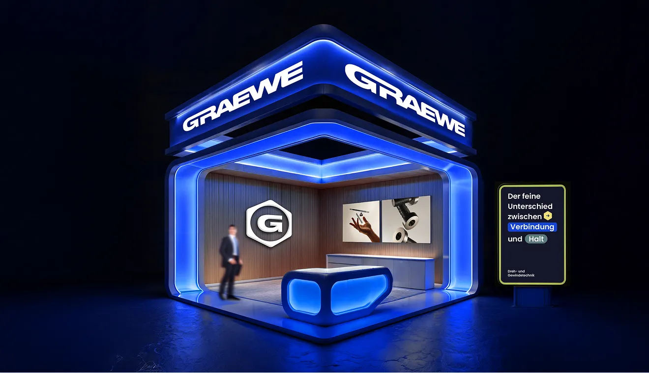
Graewe in a new look: Reliability meets a breath of fresh air
Sometimes it’s time for something new — especially when the new keeps the best of theold. With its latest rebranding, Graewe has done exactly that. A refreshed visualidentity, modern colors, and a new design language highlight graewe’s core values more clearly thanever: reliability, quality, openness and innovation — interpreted in a modernway, without losing character.
New Visual Identity
The updated look is more than a design change — it’s an expression of who we are. Natural materials such as wood and stone, paired with clean lines and premiumdetails, reflect the balance between tradition and precision. Graewe remains true to itself: grounded, responsible, and social — yet curious and forward-thinking.
Color Concept
The new palette extends beyond classic blue and gray, now complemented by warm yellow and orange accents. These tones stand for initiative, openness, and collaboration — representing the spirit of partnership and innovation that defines Graewe.
Visual Language
Graewe’s imagery connects people and machines, emotion and precision — showing that quality is not just what we produce, but how we work together. The new look invites, inspires, and connects — just like our mission: creating lasting value for our customers.